The colours we surround ourselves with matter more than ever – both in terms of what they say about us, and how they make us feel. Many of us are taking a step back and re-evaluating what matters in our lives. Around the world we are all considering the impact on our environment.
The new Global Colour Card for 2023, Stories: Colour Design by Jotun presents a palette of expressive, hopeful shades. They are purposely designed to inspire a creative ambience in our homes. The 21 colours featured are timeless and not trend driven, but chosen for their positivity, honesty and versatility. In their unique way, they introduce an element of joy into the home.
Lisbeth Larsen, Global Colour Manager at Jotun said: “Colour has an amazing power both to express how we feel about our lives and to shape it. For many people, now is a time for reflection, and thinking about what we value. Colour can be a brilliant way of expressing those values, and reminding us of them, day by day.”
Of the 21 shades featured in this year’s Colour Card, nine are new to the Jotun collection. Jotun’s dedicated colour technology lab in close collaboration with Global Colour Manager Lisbeth Larsen and her team, has created and developed a unique palette of colours ranging from smooth warming neutrals to natural, calming greens and rich, statement reds.
The new colours have been divided into groups of seven, along with existing shades from the Jotun archive to create three perfectly blended colour collections. These unique collections capture different moods and modes of expression, enabling people to easily combine complementary and contrasting shades within each collection. This creates coherent interiors that tell stories about the home and those who live there.
The three colour themes are:
1) SERENE PRESENCE
– Slow, soothing colours, soft pastels and healing greens
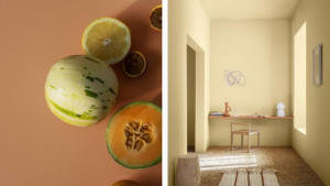
Focused on minimalism and simplicity, this palette has been designed for cleansed, clutter-free lifestyles. Colours are soft, gentle, and meditative, creating a pared-back spa-like atmosphere that helps you focus and keeps you centered.
“The home should be a place of healing,’ Larsen says. ‘A sanctuary where the mind feels at ease and the soul is lifted. Colour plays a powerful role in this sensory landscape, setting the mood, bringing us joy.
2) NATURALLY GROUNDED
– warm earth tones, muted greens, soft yellows, and oranges
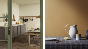
The colours in this palette connect us to the natural world, celebrating rustic lifestyles, crafted artefacts, and the beauty and character of imperfection. These calming landscape shades are ideal for giving interiors a farmhouse-chic aesthetic – or bringing a touch of countryside into the heart of the city.
“Nature is an inherently calming influence,” Larsen notes. “In even the most buzzing city, we can still create spaces that conjure the peace of the natural world and the refreshing simplicity of rustic life.”
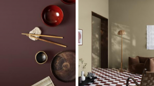
3) CURATED LIVING
– sophisticated reds, gallery-style naturals, blue accents
A balanced and curated combination of nostalgic tones and contemporary colours, this timeless palette is perfect for cultivating a home-as-art-gallery feel. It’s a confident blend of tradition and modernity conducive to truly personal creative expression.
“Our aim with this palette was to channel the comfort of nostalgia, without getting stuck in the past,” Larsen says. “By combining some antique touches with a modern sensibility, we’ve created an artistic and sophisticated family of colours.”